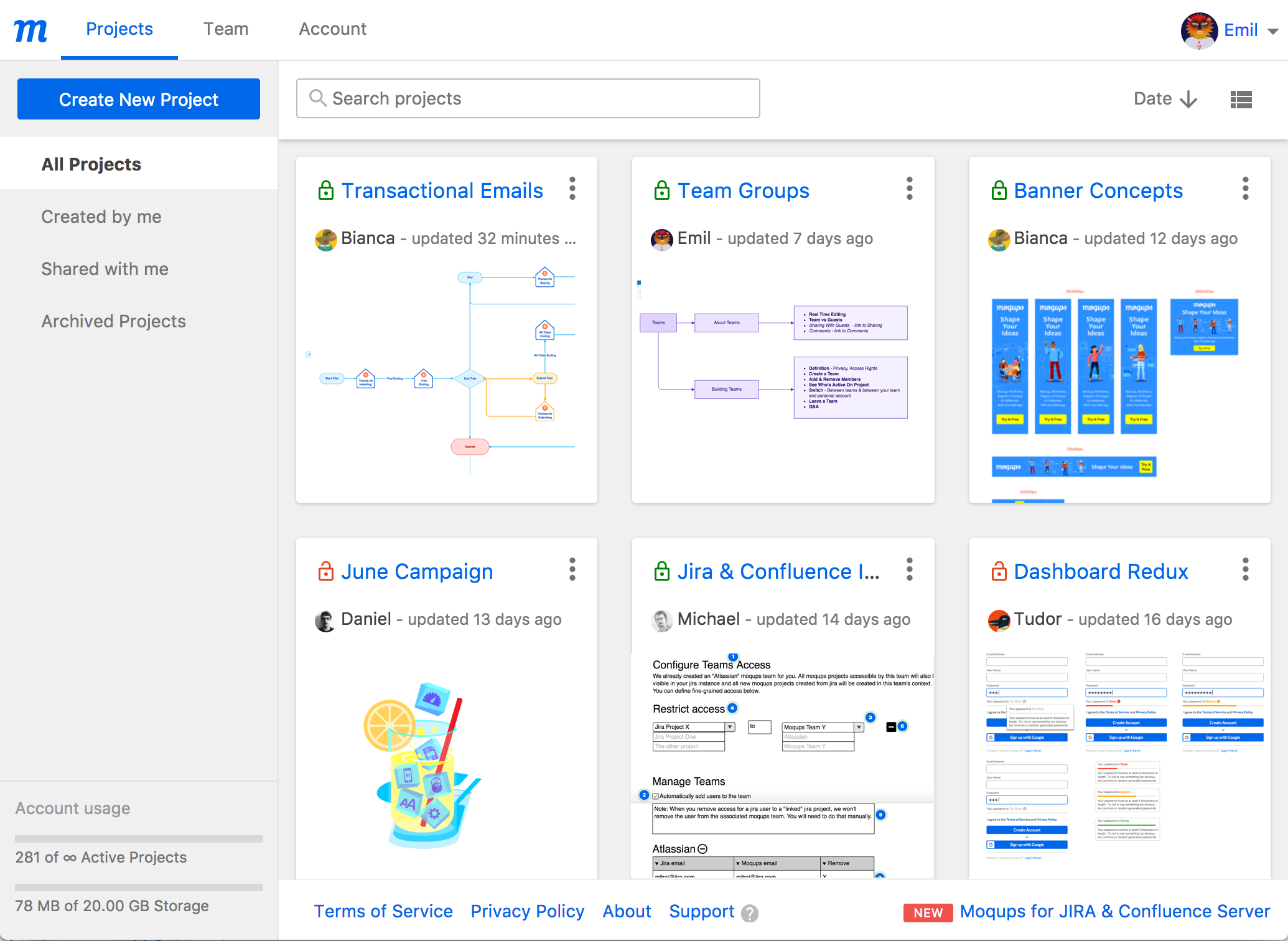
Introducing the Dashboard
Managing Projects, Teams and Accounts just got easier. The new Dashboard separates these three management functions from the Editor’s UI – and unifies them in a single space with its own URL: https://my.moqups.com.
Now, you can navigate directly to your Dashboard’s URL or, if you’re already in the Editor, you can click on any of the Projects, Teams or Accounts links to open the Dashboard in its own browser window. There, you’ll find the Projects, Teams and Accounts tabs. This makes it easy to get a quick snapshot of your team’s activity, and to work on multiple projects simultaneously.
With the introduction of the Dashboard, we’ve also redesigned the Projects Window. You can now view your projects in either Thumbnail or List view – and quickly toggle between the two. This richer visual experience makes it simple to identify projects at a glance.
Up to 10x Better Performance
We know that speed matters. Nimble performance means less frustration, more productivity, and an uninterrupted flow. That’s why we are proud to announce that we’ve optimized the initial rendering time – up to a massive 10x in some cases – for both pages and objects. Our development team made this possible by rewriting the underlying stencil-rendering architecture. Thanks to their efforts, the experience of switching between pages in Edit Mode, or using interactive prototypes in Viewer mode, is snappy and seamless. And, if you’re designing on hardware with more limited resources (e.g. touch devices or entry level laptops), then your experience just got a boost.
But don’t think we’re doing a victory lap, or resting on our laurels. On the contrary, we know our customers demand constant improvements in both stability and performance – especially as their projects grow in size and complexity. As a result, we remain committed to perpetual iteration and innovation, and to pushing the boundaries.
Global Opacity for Objects
Previously, you could adjust the opacity, individually, for both the Fill and Stroke of objects. But making an entire object semi-transparent was repetitive and cumbersome. Now, it’s easy.
Open the Format Panel (by clicking on the Format tab in the Right Sidebar) and you’ll see the global Opacity slider. For more control, you can still use the individual Fill & Stroke opacity settings. Just as before, you’ll find these inputs in Color Picker panel. If you want to customize even further, you can adjust the Fill & Stroke opacity, together with Global Opacity, for a combined visual result!
This has always been one of our most requested features – and its arrival is long overdue. The issues of rendering during Export to PNG and PDF made it a tricky technical problem. But we are happy to say that now, thanks to our revamped export engine, global opacity renders – without compromise – on both your web and your exported assets.
Improved Resizing Behaviour For Text
In the past, changing font sizes and styles within objects was a hassle. Objects often repositioned themselves unpredictably, and you had to manually adjust your text after updating the fonts. That erratic behaviour is gone. Objects now automatically, and reliably, align themselves with your font’s typographic baseline. This is a small but important change that should speed up your workflow, and reduce your frustration. In upcoming releases, we’ll be adding baseline-snapping, and we’ll tune up a variety of other actions connected to typographic parameters.
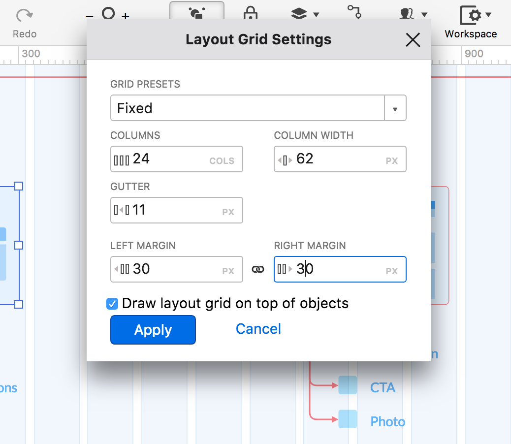
Page Layout and Paper Grids Enhancements
In response to lots of requests, we’ve improved our Grids for this release. First, there’s a subtle, aesthetic change: We’ve made the gridlines more graceful and less distracting. We’ve also improved their functionality so that, finally, you have the option of drawing the grids on top of objects. And, we’ve automated settings for both Layout and Paper Grids so that you can specify the number of columns, or their width, and the grid will calculate and adjust them accordingly. There’s also new left and right margin options for the Layout Grid. Now, it’s easier to keep elements in alignment while working faster and more precisely.
Getting Serious about Mobile
In this release, we’ve fixed a number of issues that prevented both the Editor and Viewer from functioning properly on tablets. These fixes improve basic functionality like:
- Dragging and dropping objects on the page
- Scrolling through the list of stencils in the Stencil Panel
- Selecting, resizing and moving objects on the page
All these, and a bunch of others actions, should be much better now. But this is just the first of several incremental Mobile improvements that are already in the pipeline.
Our goal is nothing less than a fully optimized Moqups experience on Mobile – and it’s one of our highest engineering priorities.