Data is the raw material of the global economy – guiding the reinvention of established companies, and driving the strategy of new ones. And that information’s power is compounded when it is easily shared, analyzed, visualized, understood and acted upon.
One of our highest priorities is data visualization and representation in all its forms, and last month, we introduced new chart and graph features and templates. Now it’s Tables’ turn.
Although grids and tables aren’t technically data visualizations, they’re often combined with charts and graphs – and often created by the same teams. Whereas charts tend to show the overview, shape, and summary of data, tables present detailed information in as close to its raw form as possible.
Great tables have several advantages. They can provide access to precise numbers and specific information in large, dense data sets. And, they allow users to scan, compare, and analyze data in multiple directions – in the order of their choice – and take action based on those insights.
The Rationale Behind Our New Table
Grid and tables are an essential part of our users’ workflow, especially if their focus is on enterprise products. In complex apps for logistics, project management, sales, customer relations, or human resources, the majority of screens may contain – or simply be – a grid or table.
The problem was, our old Grid stencil worked fine for small tables with only three or four rows and columns. But, if you wanted to mock up complex data grids, a syntax-based stencil just wasn’t up to the task.
Improving the Grid has consistently been one of the most frequently recurring topics on our support channels – and your message was clear: We needed a better grid solution. So, our rationale for creating a new Table stencil was, quite simply, our users’ voice. The only question was how to solve the problem.
The Grid’s syntax based approach wasn’t easily scalable – we would have had to invent new syntax for every new formatting option. But that would only complicate your workflow, and be the very antithesis of our mission: Moqups should offer the most productive ways to visualize ideas of any kind – and visualize at the speed of thought! Visual-ize.
The answer was clear. We had to go visual.
Our first approach was to try using open-source libraries in order to save a few dev cycles and release this to you sooner. But, once we evaluated those options, we realized that we had a Goldilocks problem – they were either too specialized or too generic for our needs. So we would have to handcraft a solution. It took us a few sprints – but it’s finally here.
It was a fun, but intensive exercise. Although we often felt as though we were reinventing Excel, the process allowed us to prepare the underlying architecture for rapid iteration and the expansion of features.
And, since this new stencil is a central piece of our future development, it’s been built with all kinds of future interoperability in mind – like the ability to share data to other stencils such as charts, import data dynamically from external sources, and much more. But, right now, it’s all about simplifying your workflow and making you more productive.
The new Table stencil offers a completely visual editing experience and provides a new set of features that allow you to customize pretty much every aspect of a single or multiple table cells. And, it tries to mimic the functionality of popular spreadsheet editors so your muscle memory should feel at home in the new environment!
So, let’s take it for a test drive and see what you can do.
Adding, Resizing, and Customizing Borders
You’ll find the new Table in the Stencils Panel. Add it to the page by dragging and dropping and, as you resize and rescale, hold down Shift if you want to maintain its aspect ratio.
Before diving into detailed editing, you might want to use the dedicated section in the Format Panel to make some initial styling decisions about the table as a whole. Here you can choose to show or hide borders, adjust cell padding, select font family and size, set border attributes, or add a drop shadow:
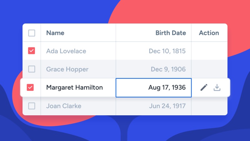
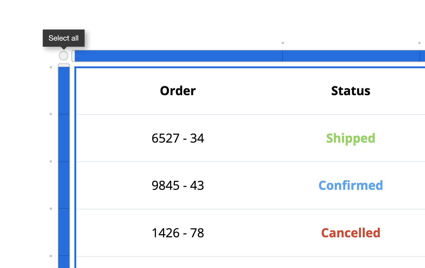
If you want to get rid of our placeholder text – and begin with a tabula rasa – before adding your own data, just click the Edit Data button (or double-click on the table) to reveal the Table headers and toolbar. Then use Select all button in the upper-left corner (or Cmd+A) and hit delete on your keyboard.
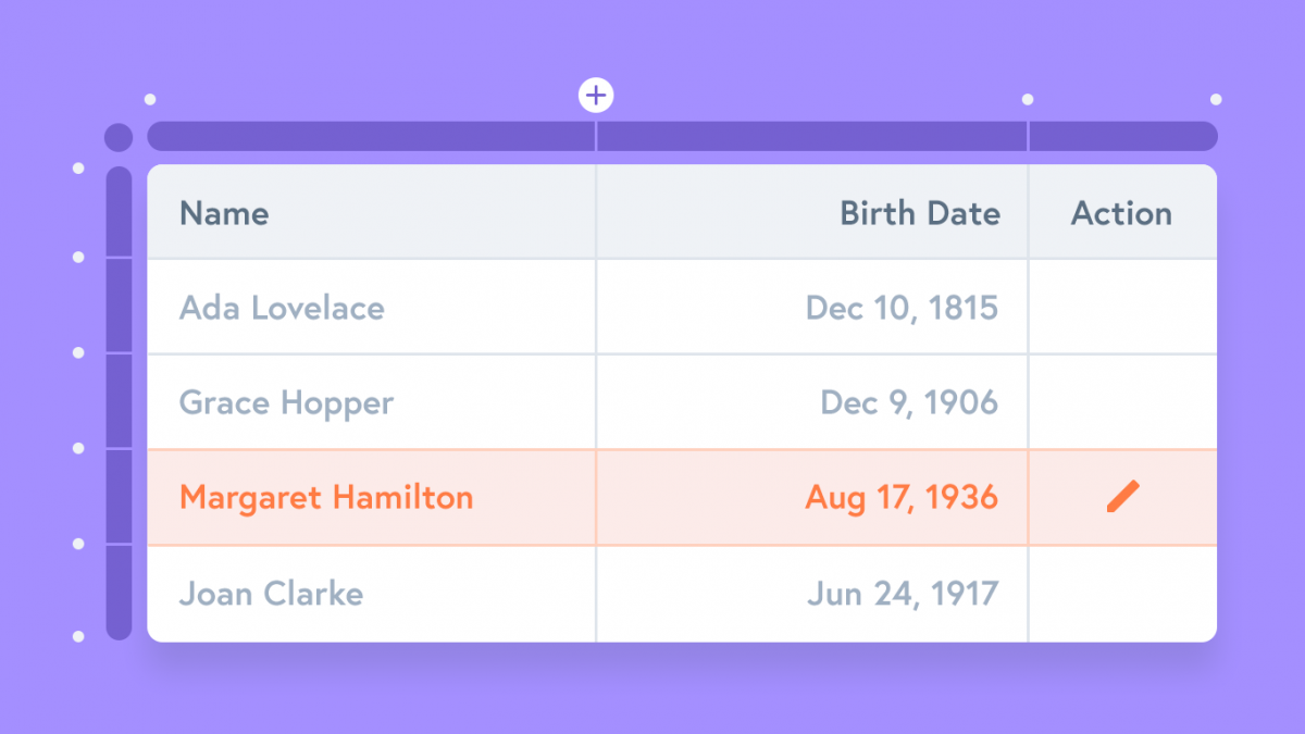
Insert, resize, and customize columns, rows, and cells
Once you’re in edit mode, the dots along the headers let you insert rows and columns in that particular position. To delete a row or column, select the appropriate header, and click the trash bin in the table’s toolbar.
To resize rows and columns, use the lines between their headers. If you want to set the rows and columns to equal sizes, just click the Distribute Cell Sizes button.
Once you have selected a row or column’s header, you can use the toolbar to adjust the text’s horizontal and vertical alignment:
The toolbar also lets you select the font color and background color for individual and groups of cells. Color can help guide the reader’s eye to interesting information, and make it easier for them to navigate your data. This also comes in handy if you want to create in-table heatmaps – where higher numbers correspond to darker or more saturated cell backgrounds.
The bottom toolbar is also where you can merge and split cells:
Use the rich-text editor to format text and add links
With a cell selected, press Enter/Return or double-click to edit the text. If you simply want to replace the text, then just start typing!
While you’re in edit mode, you can use the Quick Format toolbar to format, color or highlight selected text, or to add links.
Lighting-fast keyboard shortcuts
Finally, a couple of tips for you power-users! While in edit mode, hit the Tab key to quickly navigate between table cells. Press Shift+Tab to go back to the previous cell. Or, continue pressing Tab on the last row to add new rows to your table.
Moving forward with Tables
We know that there’s still some missing pieces to the puzzle – functionality that you need, and would make your work easier. We’re working on putting those pieces in place, but we would love to hear from you – about your priorities and use cases.
So, please send us your wishlist at support@moqups.com. After all, Santa’s coming pretty soon!

